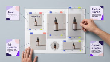
Instagram Aspect Ratio: Post, Reel, Story, and Export Sizes
Instagram aspect ratio depends on where the file appears — Feed, carousel, Reel, Story, Reel cover, and profile image each display differently. Pick a shape by placement and subject, then confirm the current specification directly in Instagram before exporting:
- Feed posts: choose square, portrait, or landscape by subject
- Carousels: match every slide to one chosen frame
- Reels and Stories: compose for full-screen vertical viewing
- Reel covers: treat as a separate crop from the video
- Profile images: center content for a tighter display crop
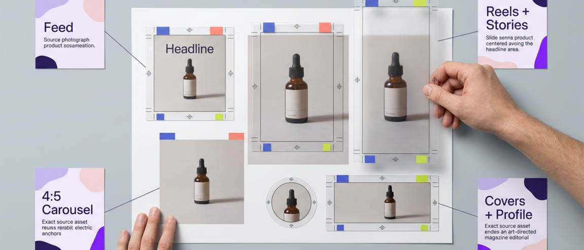
Ask five creators what shape Instagram wants and you’ll get five different numbers, because the honest answer changes by placement, not by opinion. A Feed post, a Reel, a Story, a carousel slide, and a profile picture are five separate design decisions, each with its own frame and its own way of losing a headline or a logo if you guess. Think of what follows as an Instagram post aspect ratio guide that treats every surface as its own decision rather than one universal number. The precise ratio and pixel dimensions Instagram currently accepts change often enough that the safest habit is checking Instagram’s own current publishing tools rather than trusting a figure printed months earlier. What doesn’t change as often is the decision logic underneath it: which shape fits which subject, and where the review step has to happen before you publish.
On this page
Choose the right Instagram format for the placement
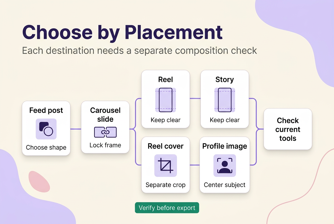
There’s no single best aspect ratio for Instagram posts, or for anything else on the platform, because “Instagram” isn’t one surface — it’s at least six, and each one is built and reviewed differently: the main Feed, carousel slides, Reels, Stories, Reel covers, and profile images. Matching only the shape isn’t enough either, since a correctly proportioned file can still be treated differently once it lands in a preview, a full-screen player, or a tighter crop.
Instagram’s own current publishing tools are the only reliable source for exact ratios, pixel widths, and file limits, and those numbers shift often enough that this guide sorts by convention and production context instead of printing a specific figure as fixed fact. Confirm the current specification directly in Instagram before you export a final file.
| Placement | Common shape convention | Source-asset composition | What to verify before publishing | Production default |
|---|---|---|---|---|
| Feed post (single image) | Square, portrait, or landscape | Built around one dominant subject or scene | How the current upload flow crops or presents this shape in the grid and single-post view | Portrait for vertical subjects, square when content gets reused elsewhere |
| Carousel slide | One consistent frame across all slides | Every slide designed to the same canvas so subjects align edge to edge | Whether the composer treats every slide as the same shape or lets one slide set it | Lock the frame before any slide is designed |
| Reel | Full-screen vertical | Subject and text kept clear of top and bottom overlays | Where captions, profile details, or controls currently sit over the frame | Compose vertically from the first frame, not cropped afterward |
| Story | Full-screen vertical | Similar frame to Reels, built for a shorter tap-through view | Where stickers, replies, or timers currently sit over the frame | Treat text and stickers as movable, not fixed to one spot |
| Reel cover | Separate still crop from the video frame | One representative frame or custom image, framed independently | How the cover currently displays in a grid view versus a full playback view | Choose or design the cover after the video is locked |
| Profile image | Square source (common convention) | Subject centered enough to survive a tighter crop | How your own account’s profile image actually displays across the app right now | Keep logos and faces centered, not pushed to a corner |
These categories describe how each placement is commonly built, not a confirmed list of Instagram’s currently accepted ratios or export sizes — the exact numbers can vary by app version, account type, and region, so treat this as a starting composition and check Instagram’s current tools before finalizing a file for publication.
Ratio, canvas, export, crop, and safe zone are separate decisions
Ratio is the shape of the finished asset. Canvas is the workspace you design in before anything is exported. Export is the file you actually deliver to Instagram. Display crop is how a specific placement presents that file once it’s live. Safe zone is a buffer you build in around critical elements — text, logos, faces — as a precaution, not a guaranteed boundary the platform enforces the same way everywhere.
Matching the ratio alone doesn’t resolve resolution, cover, crop, or overlay risk, because each of those is a separate step downstream of the shape decision. Enlarging a correctly proportioned design after it’s already built doesn’t restore detail that was never there — decide the intended export canvas before you add fine typography, a logo, or raster graphics, not after.
Choose a Feed-post shape based on the visual job
The generic advice to “always post square” or “always post portrait” breaks down the moment the subject doesn’t fit that shape — a wide product lineup crammed into a tall frame, or a portrait squeezed into a square, both lose the one thing the post was built to show. This isn’t a platform rule; it’s a composition-first decision, and the subject should win every time.
Choose portrait when a vertical subject is the priority — a person, a tall product, a screenshot with more height than width. Choose square when the content will be reused elsewhere or needs a balanced, consistent grid look. Reserve landscape for material that’s genuinely wide, like a group scene or a wide screenshot, since giving up vertical space in the feed is a real cost, not a neutral choice. When none of those fit without cutting into the subject that made the post worth publishing, redesign the layout rather than force-fitting it — a late crop rarely recovers what got cut, and a resize after the fact tends to make the compromise worse, not smaller.
Reels and Stories need their own composition checks
Reels and Stories are both commonly composed as full-screen vertical video, but treating them as interchangeable is the habit that produces the most avoidable cropping and overlay problems. Sharing a vertical convention doesn’t mean the two share a destination, a viewing pattern, or the same on-screen elements near the edges of the frame.
Compose both from a vertical frame at the outset rather than cropping a horizontal clip into one after editing — that’s how footage ends up with a subject’s head clipped or a caption pushed off-screen. Keep primary text, calls to action, and branding away from the very top and bottom of the frame as a working assumption: both surfaces commonly place captions, profile information, or interaction controls near those edges, though exactly where can shift with app updates, account type, and rollout. Treat any margin you build in as a buffer, not a guaranteed clear zone, and check the current preview before you publish anything time-sensitive.
Decide the carousel frame before designing the slides
Independently designed slides with mixed shapes create the same problem every time: nobody resolved which frame the carousel would actually use before the design work started. Many creators assume the first slide added automatically controls how every other slide displays, but that isn’t something to rely on without checking your own composer, since carousel compatibility behavior isn’t confirmed here and can vary.
Work in this order instead. Pick one frame convention before any slide is designed, not after the set is half-built. Prepare every slide to that same frame so subjects and margins line up across the swipe. Inspect the crop treatment inside the current composer before publishing — not just in your design tool’s preview, since the two aren’t guaranteed to match. If something doesn’t line up, fix the source file and re-export it rather than trusting a late, in-app crop adjustment to paper over the mismatch.
A correctly sized Reel can still need a separate cover check
Passing a full-screen playback check tells you the video plays cleanly. It tells you nothing about whether the cover — the still image representing that Reel wherever a thumbnail is shown — communicates anything at a glance. The video frame, the cover asset, and the placement preview are three separate compositions, and a Reel can clear the first while failing the other two.
Check whatever cover-selection option your account currently offers, and look at where that cover actually shows up before you assume it’s fine — different placements aren’t guaranteed to crop the same still identically. Keep text, logos, and faces clear of the edges as a precaution rather than a guarantee, and open the exact destination where the cover will be seen rather than judging it from an editing preview alone.
Compose profile images for the displayed crop
A profile image’s source shape and its displayed treatment are two different things, and assuming they match is a common way a corner-based logo or a line of text gets clipped. Common practice is to build the source as a square and expect it to show up in a tighter, rounded-looking crop elsewhere in the app — but treat that as a design convention to verify in your own account, not a confirmed specification. Keep faces, wordmarks, and any text centered enough to survive a tighter crop, rather than anchored to a corner a rounded display treatment wouldn’t show.
Export the final file, not just the correctly sized project
A design can be built at exactly the right canvas and still leave the editor smaller, softer, or resaved through a “quick” export setting — the working file and the delivered file aren’t always the same object, and the gap is easy to miss because nobody opens the exported file before it goes up.
Two things are worth separating here. First, the current official requirements for file type, dimensions, and other upload constraints live in Instagram’s own current tools and documentation, and they change enough that this guide won’t print specific numbers as fixed fact — confirm them directly before you finalize an export. Second, regardless of what those exact numbers are this month, a few workflow habits hold up: export at the size you intend to publish rather than an arbitrary default, avoid scaling an asset up or down more than once, avoid unnecessary repeated re-saves of the same file, and open the delivered export — not just the design file — before you upload it.
Use placement-specific release checks before reusing a preset
A flawed preset can get repeated across an entire campaign before anyone notices the crop or legibility problem, because the first post looked fine and nobody checked the second one differently. Before you reuse any format setup, run through it in this order: confirm the placement and the source shape you’re building for; inspect the final export against Instagram’s current specifications; review carousel slide-to-slide consistency, or a Reel’s frame-and-cover composition, since those are different checks with different failure modes; then look at the published result on the actual surface it appears on before you repeat the same setup on the next post.
A carousel needs slide alignment checked across every panel. A Reel needs the video frame and the cover checked separately. One generic glance at a thumbnail catches neither reliably. For the broader production workflow this sits inside, the Instagram Content Creation hub covers the adjacent decisions around what to post, not just how to size it — start there for the placement branch you’re working on, then apply its first production step to this checklist.
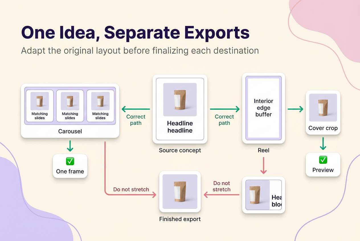
One source concept can travel, but one finished export may not
A single creative idea can be adapted across Feed, Reels, and Stories without much friction. A finished, already-exported file built for one of those placements shouldn’t be assumed to fit another until its shape, crop, overlay, and cover context are checked again. Build separate crops from the original layout for each destination before finalizing typography, rather than stretching, padding, or retrofitting a file that was already finished for somewhere else.
Aspect ratio is a fit decision, not a reach or engagement guarantee
No shape, canvas, cover, or export setting guarantees reach or engagement — those outcomes depend on far more than a frame decision, and treating a ratio as a growth lever is a common misreading of what these choices actually control. If you compare performance across formats, confirm current Instagram Insights definitions before comparing them: a Reel’s view measure and a Feed post’s reach aren’t guaranteed to be counted the same way, and treating mismatched metrics as interchangeable can make a comparison look meaningful when it isn’t.
No method guarantees a specific number of followers, views, or income. Results depend on niche, content quality, and account history.
 120,000+ creators say yes
 Real Active Accounts


 Username Generator
  Hashtag Generator
  Font Generator