Instagram Carousel Ideas: 15 Ready-to-Build Posts for Creators and Small Businesses
Instagram carousel ideas that work well for small businesses and creators build one promise across every slide, using formats like:
- A saveable checklist covering one repeatable process
- A common-mistake correction that reframes an assumption
- A before-and-after transformation with visible proof
- A mini tutorial that teaches one specific skill
- A comparison guide that helps a buyer decide
On this page
A carousel earns the swipe when the sequence commits to one point from the first slide — the topic itself matters less than that follow-through. This page works through 15 original carousel concepts built for creators and small businesses, each with a goal, an opening hook, a slide order, and a low-effort asset option so a missing photo shoot doesn’t stop the post. Two of the ideas are expanded into full slide-by-slide examples so the planning logic is visible from the first slide to the final call to action. None of it promises a specific reach or engagement outcome — the job here is a carousel that’s finished, coherent, and clear enough that someone acts on the last slide.
15 Instagram Carousel Ideas You Can Adapt This Week
Fifteen ready-to-build carousel concepts cover teaching, trust-building, product decisions, launches, and audience engagement — each defined by a goal, a first-slide hook, a slide order, a low-production asset option, and a matching final action.
On Instagram, a carousel is a single Feed post that can hold multiple photos and videos, arranged in whatever order is chosen before it’s shared (Instagram Help Center). The ideas below all work within that one-post structure.
| Scenario | Goal | First-slide hook | Slide sequence | Low-production asset | Final CTA |
|---|---|---|---|---|---|
| Saveable checklist | Teach a repeatable process | “Save this before you [task]” | Title → steps 1–5 → recap | Text-only slides | “Save for later” |
| Common-mistake correction | Correct a mistaken habit | “You’re probably doing [task] wrong” | Mistake → why it fails → fix → recap | Text-card comparison | “Which one is you?” |
| Myth-versus-fact explainer | Clear up a misconception | “Myth: [claim]” | Myth → fact → reason → takeaway | Bold text slides | “Save for next time” |
| Before-and-after transformation | Show a visible result | Split before/after image | Before → context → process → after | Two phone photos | “DM to start yours” |
| Mini tutorial | Teach one specific skill | “How to [skill] fast” | Result preview → steps → pitfall → tip | Step photos or a simple diagram | “Try this and tell us” |
| Behind-the-scenes process | Build trust in the work | “What happens before you get [product]” | Setup → key step → detail → result | Candid workspace photos | “Ask us anything” |
| Founder-origin story | Build personal trust | “Why I started [business]” | Problem → turning point → decision → today | One personal photo | “Follow for more” |
| Product detail showcase | Explain a product’s features | Close-up product shot | Overview → feature → feature → who it’s for | Plain-background photos | “Link in bio” |
| Product use-case chooser | Help a buyer decide when it helps | “Which one fits you?” | Situation A → match → situation B → match | Split text cards | “Tell us your situation” |
| Comparison guide | Help a buyer choose between options | “Option A vs Option B” | Pros/cons A → pros/cons B → when each fits | Two-column text slides | “Save before you decide” |
| Launch or restock reveal | Announce a new or returning item | “It’s back” / “New: [item]” | Teaser → what’s new → detail → availability | Product photo + text | “Link in bio” |
| Customer-question FAQ | Answer common pre-purchase questions | “What we get asked most” | Q1 → answer → Q2 → answer → Q3 → answer | Text-only slides | “Ask your own question” |
| Proof-and-process case breakdown | Show how a result was reached | “How we got from A to B” | Start → step → obstacle → adjustment → outcome | Screenshots or text recap | “Save if you’re working on this” |
| Local resource guide | Show local relevance | “5 [local] spots worth knowing” | Intro → item → item → item → close | Phone photos of each spot | “Which have you tried?” |
| Audience choice prompt | Invite a response, not a sale | “Help us decide: A or B” | Set-up → option A → option B → how to reply | Two simple text cards | “Reply with A or B” |
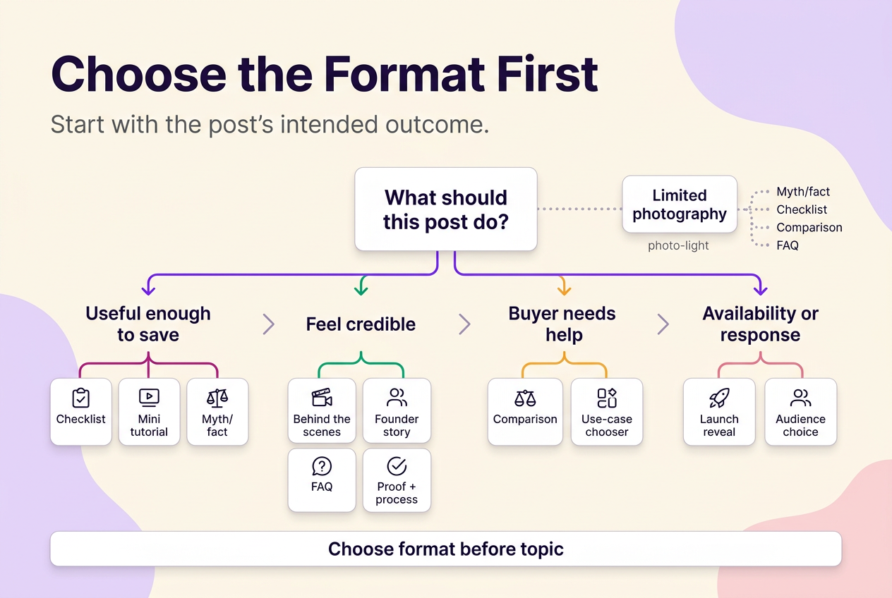
Choose the Format Before You Choose the Topic
The format decision comes before the topic. Teaching formats — checklist, mini tutorial, myth/fact — work when the goal is to be useful enough to save. Trust formats — behind-the-scenes, founder story, FAQ, proof-and-process — work when the goal is to feel credible rather than anonymous. Decision formats — comparison guide, use-case chooser — work when a buyer needs pointing toward the right option. The launch or restock reveal works when there’s an actual availability change to announce, and the audience choice prompt works when the point is a response rather than a sale.
When photography is limited, the practical priority is to start with a format that never needed a photo shoot: myth/fact, checklist, comparison, and FAQ concepts run on text-led slides, screenshots, or a quick product close-up. Before-and-after and behind-the-scenes formats work best once there’s real visual change or process to show; when that material isn’t ready yet, a text-led format keeps the post clear without waiting on a shoot.
Two Full Carousel Examples, Slide by Slide
The two carousels below are original illustrative examples built to show planning logic, not documented results from a real account.
Example 1: a bakery’s holiday preorder carousel. A small bakery taking pie preorders for a holiday weekend could build a five-slide problem-to-CTA sequence:
| Slide | Purpose | On-slide copy direction | Visual asset | Slide or caption |
|---|---|---|---|---|
| 1 | Name the problem | “Waiting until the week of the holiday to order usually means picking from what’s left.” | Text-only, brand-color background | Slide |
| 2 | Show the options | Flavor names, one line each, readable at a glance | Text list slide | Slide |
| 3 | Give proof | Short caption line only if it’s an actual customer quote — no invented testimonial copy | Photo of a finished pie | Slide |
| 4 | State the deadline | “Order by [date] to guarantee your pie” — a clear date is easier to act on than “order soon” | Text slide | Slide |
| 5 | Close with the action | “How to order” | Text + small product photo | Slide states the action; caption holds the full ordering process, pricing, and pickup window |
Example 2: a bookkeeper’s expense-tracking carousel. A freelance bookkeeper could build a mistake-to-action sequence for other freelancers:
| Slide | Purpose | On-slide copy direction | Visual asset | Slide or caption |
|---|---|---|---|---|
| 1 | Name the mistake | “Tracking expenses in your head instead of a system costs you at tax time.” | Text-only slide | Slide |
| 2 | Explain the cost | Mixed personal and business spending, missed deductions | Text-only slide | Slide |
| 3 | Run a self-check | Three short questions a reader can answer about their own habits | Text-only slide | Slide |
| 4 | Give corrective steps | Two or three fixes stated in plain language | Text-only slide | Slide |
| 5 | Close with the action | Save-or-inquiry prompt, since this concept is built to be kept rather than acted on immediately | Text-only slide | Slide stays diagnostic; caption carries what a consultation covers and how to book one |
Give Every Slide a Job
A repeated point is the mistake worth watching for — not a weak topic, but a slide that restates something already said instead of moving it forward. A workable fix is to build the whole post around one sequence pattern: problem → solution, claim → proof, before → after, process → result, myth → correction, or choice → recommendation. The opening hook should match that pattern — a mistake, a contrast, a checklist promise, a transformation, an objection, or a piece of proof — rather than a generic “swipe for more.”
Deciding what belongs on a slide versus in the caption comes down to one question: does the reader need this to understand the point without opening the caption at all? If yes, it belongs on a slide; ordering details, service boundaries, and a longer founder note can sit in the caption instead. A video included in a carousel isn’t treated as a Reel and doesn’t get Reels placement or features (Instagram Help Center), so a still image is often the simpler choice for a comparison or step list; motion is worth using when something is genuinely easier to show moving than static.
For follow-up formats that don’t need a full carousel, see Instagram Story ideas for polls, question stickers, and quick updates that extend the same topic without repeating it in another carousel.
A Quick Pre-Publish Check
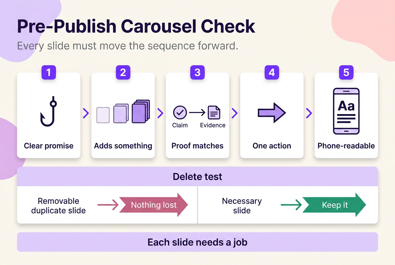
Before publishing, confirm five things: the first slide states one clear promise; each following slide adds something instead of repeating the last one; any proof or example actually matches the claim; the final slide asks for one relevant action; and the text stays readable at phone size. Instagram allows existing carousel media to be reordered or removed after a post is shared (Instagram Help Center), but reviewing the intended sequence beforehand avoids relying on that after the fact. One more check worth running: delete a slide in your head — if nothing is lost, it either belongs somewhere else in the sequence or shouldn’t be there.
 120,000+ creators say yes
 Real Active Accounts


 Username Generator
  Hashtag Generator
  Font Generator